Work
All Work
Packaging / Influencer Kits
Digital / Social / Motion / Website
Events / Environments / Retail
Branding / Product Graphics
About
Contact
Work
All Work
Packaging / Influencer Kits
Digital / Social / Motion / Website
Events / Environments / Retail
Branding / Product Graphics
About
Contact
Featured
Converse X Minions Visual Center Development
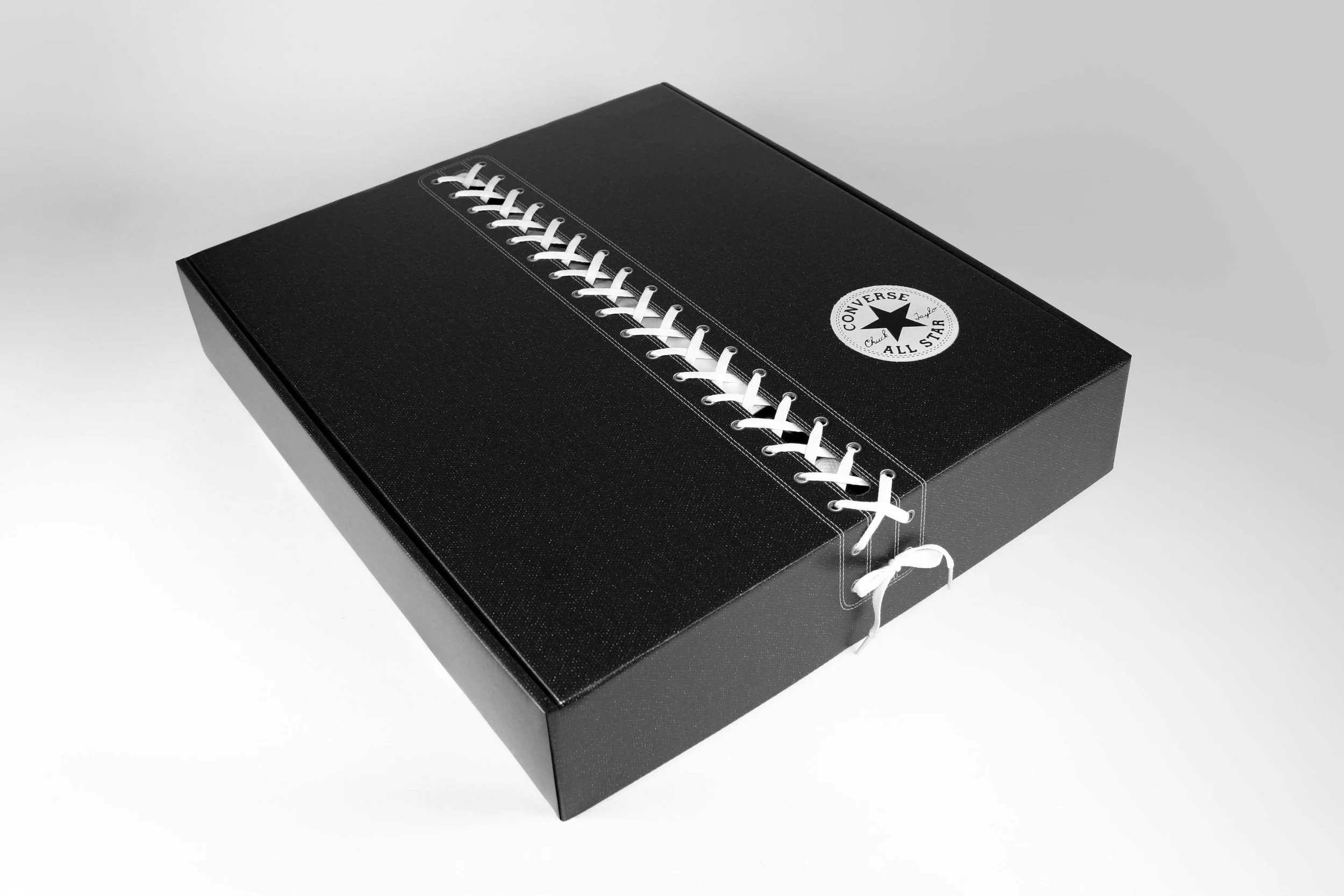
CHUCK TAYLOR ALL STAR CX—INFLUENCER SEEDING KIT DESIGN & FULFILLMENT
CONVERSE—HELLO KITTY AT SHOE PALACE
Broccoli City Festival: Outdoor Digital Promo
Converse - DeLuxe Collection Influencer Kit
CONVERSE—PRIDE INFLUENCER KIT DESIGN & FULFILLMENT
CONVERSE—PRIDE INFLUENCER KIT DESIGN & FULFILLMENT
University of Florida Football Center Design
FORTNITE + THE KID LAROI - INFLUENCER KIT
CONVERSE—JOE ROGERS 35-YEAR ANNIVERSARY TRUNK DESIGN & FULFILLMENT
Converse—XXHi—Influencer Kit
MAGIC: THE GATHERING + LORD OF THE RINGS—SEEDING KIT
DUNGEONS & DRAGONS—FOR ALL SEEDING KIT
MAGIC: THE GATHERING—BROTHERS WAR—KIT
MAGIC: THE GATHERING—DOMINARIA UNITED INFLUENCER KIT
MAGIC: THE GATHERING—BATTLE FOR BALDURS GATE
CONVERSE—LOONEY TUNES PRODUCT INFLUENCER SEEDING KIT DESIGN & FULFILLMENT
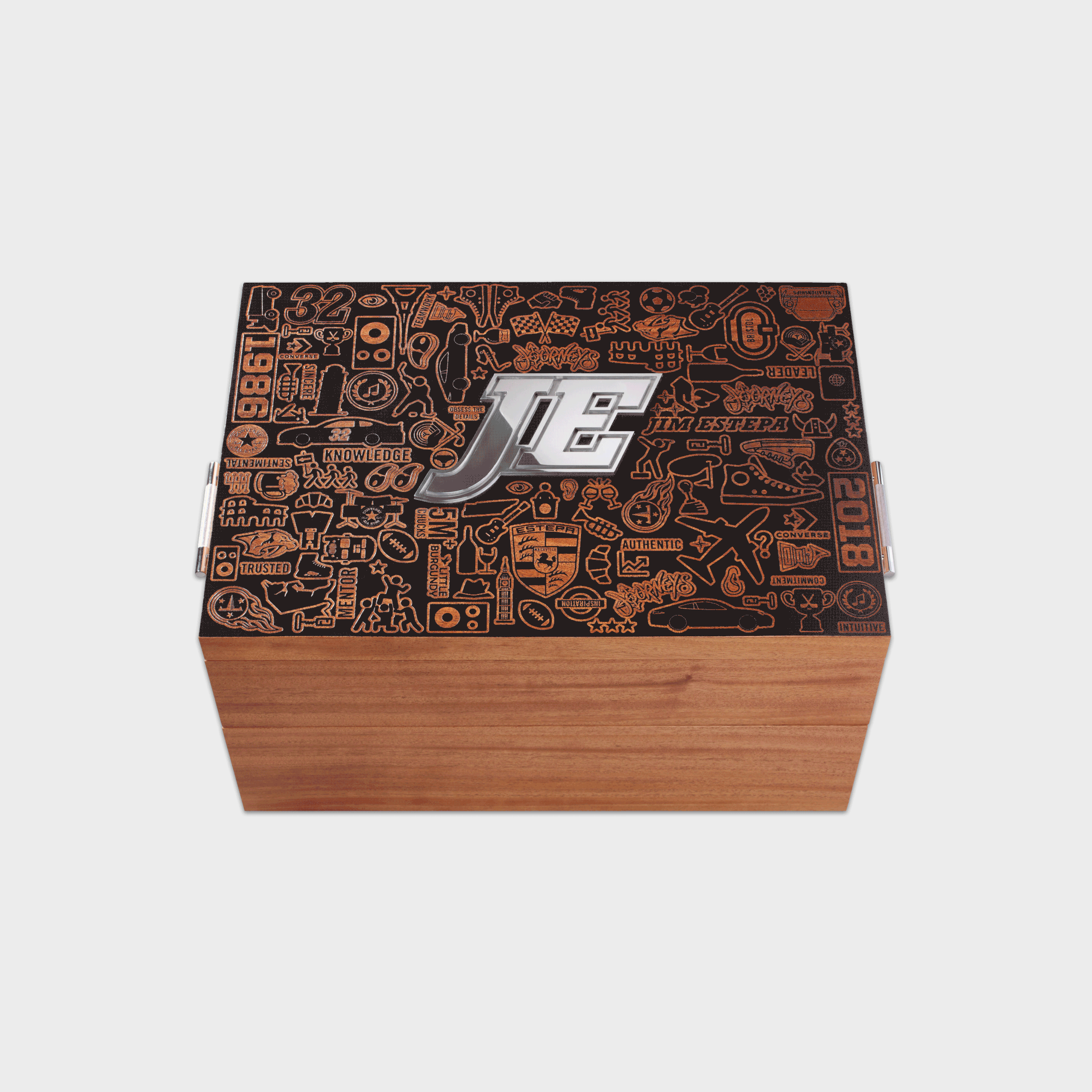
CONVERSE & JOURNEYS—JIM ESTEPA RETIREMENT KIT DESIGN & FULFILLMENT
CONVERSE & JOURNEYS—BACK TO SCHOOL INFLUENCER SEEDING KIT DESIGN & FULFILLMENT
CONVERSE—RICK AUSICK RETIREMENT KIT DESIGN & FULFILLMENT
Safeway—US Track & Field Championship Visitor Center Design
NIKE VAPOR ONE—IDENTITY & PACKAGING DESIGN
NIKE—V360 BASEBALL GLOVE PACKAGING DESIGN
NIKE—ELITE SOCK COLLECTION PACKAGING DESIGN
CONVERSE—CANADIAN WEBSITE LAUNCH - INFLUENCER SEEDING KIT DESIGN & FULFILLMENT
CONS—AS-1 Skateboard—Influencer Kit
NIKE SOCCER—SAN TEPITO FÚTBOL CLUB IDENTITY
NIKE—SUPER BOWL PREMIUM EDITION GLOVE PACKAGING
Nike—Innovation Soccer Ball Graphics
NIKE—SOCCER & BASKETBALL PACKAGING DESIGN