Crafting a Strategy was launched as an online, subscription based website that catered to the business concerns of craft breweries. We worked closely with business owner Sam Holloway to develop an identity and graphic system that was closely tied to business recommendations that he advances on the site. The five pint glass shaped elements within the logo represent 5 organizing principles of his core curriculum. We also developed a series of friendly icons to help way finding throughout the site content, along with some funny headlines to attract site visitors into some very serious business white papers.
Flightdeck friends Melissa Hernandez Kelley and Sam Kelley have a love for simple, honest, authentic Southern California, taco shop, squeeze bottle hot sauce. They couldn’t find what they wanted in Portland grocery stores, so they made their own. Their sauces are magnificent!
The Show Hot Sauce is a collection of all-natural pepper sauces inspired by authentic Mexican salsas from their favorite kitchens and restaurants. Made from minimalist ingredients – peppers, organic vinegar, salt, and a little bit of pristine Northwest water, they used blends of peppers to achieve their distinctive flavors. When their signature recipes were perfected, they tapped us to visualize the essence of their brand with a colorful and handmade esthetic to grace the coveted hot sauce squeeze bottles. We used a hand drawn pepper as the central design element along with hand drawn ‘sharpie’ lettering to lighten up the mood of the communication.
Put this sauce on your favorite foods and let The Show begin.
This project is a prime of example of how good work leads to more good work. Earlier in the product development cycle of the Nike Vapor One Football, we were tapped to design the Vapor logo system that’s shown here. The logo was so well received that months later, we were called in to bring it to life on packaging at retail.
While living abroad, our friend Peter McCoy discovered an exceptional, curated selection of Arabica coffee beans from the Hinterland coastal region of Eastern Australia above Byron Bay. The perfect environmental conditions and traditional organic farming techniques produce a bean with tremendous flavor and naturally occurring lower caffeine levels, (25% of traditional roasts) perfect for a focused and harmonious approach to life – all day, everyday.
This discovery presented a great opportunity to introduce this amazing product to a growing segment of health-conscious American consumers wanting to reduce caffeine intake without having to switch to de-caffeinated coffee or tea. Peter began importing the beans to the U.S. and contacted us to create an identity for the brand.
After a naming and writing exploration, we landed on the aboriginal word "Omaroo" which means ‘beautiful view’ in reference to the high view over the Pacific Ocean at Byron Bay. We combined this conceptual embrace of nature with aboriginal-inspired textures and colors to create a very restrained yet expressive perspective on the identity system and brand, perfectly articulated in the tagline "Cheer up, Slow down, Chill out." Sage advice indeed.
Nike tapped our creative director to create an identity system for the San Tepito Futbol Club branded product. The initiative was an effort to promote participation in futbol, which was often kids only salvation from trouble. They played where they could, with what they had. In areas of high crime and questionable ethics, futbol offered structure, goals, respect, and pride to kids, which, left on their own could easily choose other, more dangerous paths.
The identity system is inspired from a wide variety of relevant sources - from the 1970 Mexico World Cup identity, to local tattoo styles, to Mexican Luchadores and Day of the Dead folk art from the region. The system intends to communicate a visceral passion and heritage story of the beautiful game as it is played in the dusty streets and empty lots of this infamous barrio in Mexico City.
Our friends at craftingastrategy.com devised a clever fundraising effort for the Leukemia and Lymphoma Society of Oregon (LLS). They partnered with a group of area craft breweries, which each brewed up a signature batch of limited-edition beer. The proceeds of this beer were then donated to the LLS.
We were tapped (pun intended) to create the identity for this effort, from naming to graphic design. Out for Blood was born from a desire to create an attention-grabbing brand message that could stand alone in the crowded and eclectic craft beer environment. We love the powerful dual meaning that both supports the LLS while giving the proverbial middle finger to the disease.
This project was done while working as a Design Director at Downstream where they developed a separate business unit to design and build sports environments.
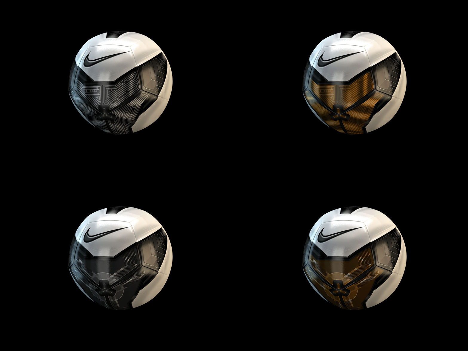
Nike wanted to push the boundaries of soccer ball design and fabrication. We were able to collaborate with Nike Innovation engineers as they created new processes and prototypes. We explored different quantities and qualities of ‘heat-fused’ seam patterns applied to the ball which were then measured for aerodynamic effectiveness on the field. During the development process, the “performance” seams began to inform graphic opportunities over the ball which drove the addition or subtraction of graphics to affect a players’ visibility of the ball while in motion. Once effective seam patterns and graphic blocking patterns were identified, Nike encouraged us to explore the boundaries of graphic customization and branding to create bespoke performance product for individuals and organizations.